Google Maps in DataStudio just don’t provide the granularity you need when you’re looking at data like COVID cases or election results – data that is collected and acted on at the county level.
Without good maps, you’re stuck with presenting data in tables and that’s just not effective in communicating quickly and clearly.
- Even a small table of COVID infection rates for 64 counties can take minutes to understand and process. Which counties have good and bad infection rates? Does it matter if they are rural or urban counties?
- Or consider election results. Color US election results by state and Montana’s 147,000 square miles of empty land look incredibly important. In Texas, the city of Austin is less than 300 square miles. Austin and Montana have about the same population – if we color by land Montana looks 500 times more important.
I’ve been providing insight to COVID data for my home state of Colorado with posts on r/CoronavirusColorado. I wasn’t satisfied with the state of Colorado COVID dashboard where the county cases map looks like this:
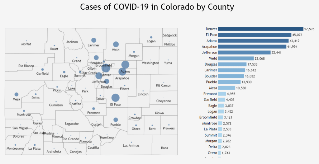
It shows total cases for all time for each county, but what I wanted to see was which counties had high and low rates of infection now.
Immediate understanding of geographic data
That’s what I wanted. Easy comparison of counties where infection rates were definitely better or worse than the rest of the state. But how? The geographic facilities in DataStudio don’t operate at the county level.
I’m happy to report that success came very quickly! Here’s a map from January 27, 2021 that shows which counties have significantly higher and lower weekly confirmed case rates. Red is high, green low. Uncolored counties have case rates that are statistically indistinguishable from the rest of the state.
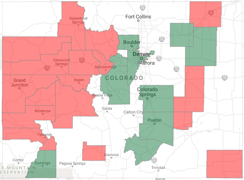
The county-map data views have driven a surprising result. Many people have tried to hide from the pandemic in rural counties because the number of cases is lower. But it turns out that the low population mountain towns have the highest infection rates right now. Stay safe!
Using BigQueryGeoViz to generate county data maps
Lak Lakshmanan’s excellent article “How to Create County Boundary Maps Only of Populated Areas” was key to the approach I used. Half a day and I had my first maps. There were three key steps:
- Acquiring and transforming state COVID data
- Discovering the open county data set published by Lakshamanan
- Learning the tool BigQueryGeoViz
Colorado COVID data
Colorado COVID data is published daily in an open data portal in spreadsheet format. I upload the county data to a BigQuery table.
The county data table has ever-increasing case numbers. I wrote a view to turn those into a last-seven-days count of new cases by county. With case numbers and county populations, I could generate weekly new per-capita case rates easily.
I previously wrote about identifying significantly high and low county case rates using an AB significance test, so I knew which county case rates were statistically significant.
County boundary dataset
Now to translate that to a geographic view.
Fortunately for me, Lakshamanan saved a public BigQuery dataset. All I needed to do was join it to my county table
code ai-analytics-solutions.publicdata.us_tracts
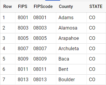
Lakshamanan’s dataset uses “county FIPS codes” which are available from the US Department of Agriculture . I used the government data to make a FIP code table so my county names could JOIN with Lakshamanan’s FIPS codes.
Visualize with BigQueryGeoViz
BigQueryGeoViz is a free Google tool for geographic data mapping. It’s a single page web application that pulls data directly from your BigQuery account. You’ll need to grant appropriate permissions the first time you use it.
First I wrote a query that joined my case rate table to the FIPS code table, and then to the Lakshamanan public data set.
WITH recent_COVID AS (
SELECT
cfc.FIPScode as county_fips_code,
tws.caseSig
FROM project.Example.ThisWeekSig tws
JOIN project.Example.CountyFIPSCodes cfc
ON cfc.county = tws.county
WHERE tws.caseSig>3.0 or tws.caseSig < -3.0
)
SELECT
tract_geom, populated_tract_geom, caseSig,
if(caseSig >0, “#FF000”, “#008000”) AS HotColdColor
FROM
recent_COVID rc
JOINai-analytics-solutions.publicdata.us_tracts
USING(county_fips_code)
In the second SELECT, I generated a color identifier for hot and cold counties. Red for hot, cold for green. You can do this in GeoViz as well, but I found it easier to use SQL. The query gets pasted directly into GeoViz. Run it to pull the query results into GeoViz. Tws.caseSig in the first query is significance Z-score – standard deviations that the county per-capita rate is different from the rest-of-state rate. Three standard deviations makes me very sure that the rates are different by more than chance!
I pasted the query directly into GeoViz.
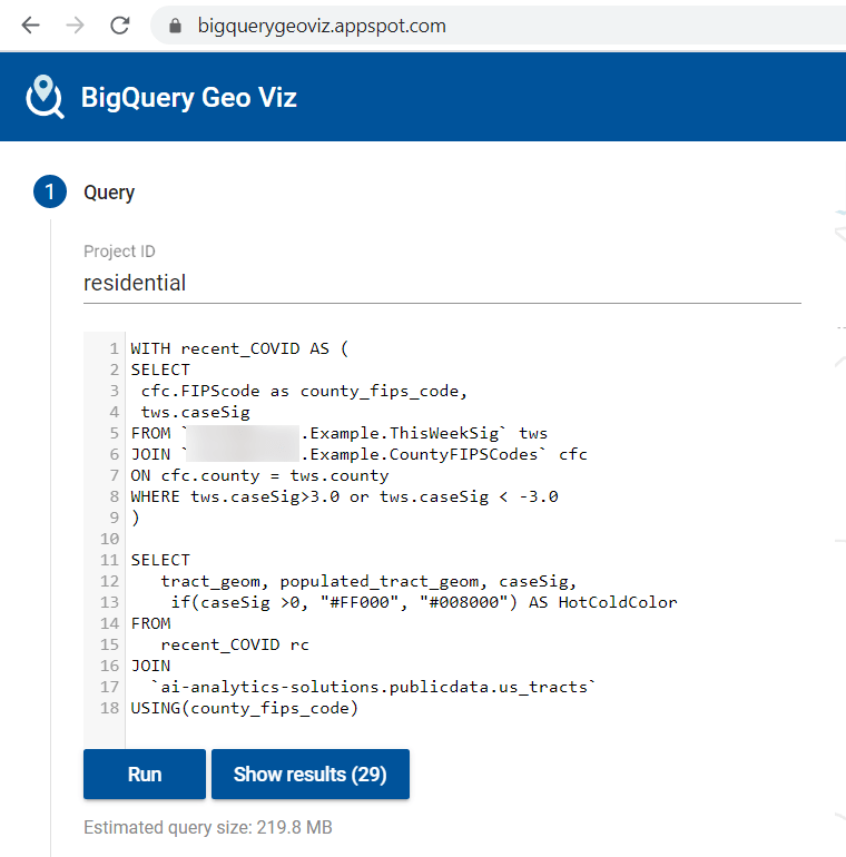
Notice the query size. You pay BigQuery charges for the amount of data you query. It’s a good idea to use small tables and views when you’re using interactive tools like GeoViz and DataStudio to keep your costs down. 220MB costs a tiny fraction of a cent.
Now let’s move down to the Style section. It took me several tries to figure out what the various styles meant and how to use them. Here’s what I settled on.
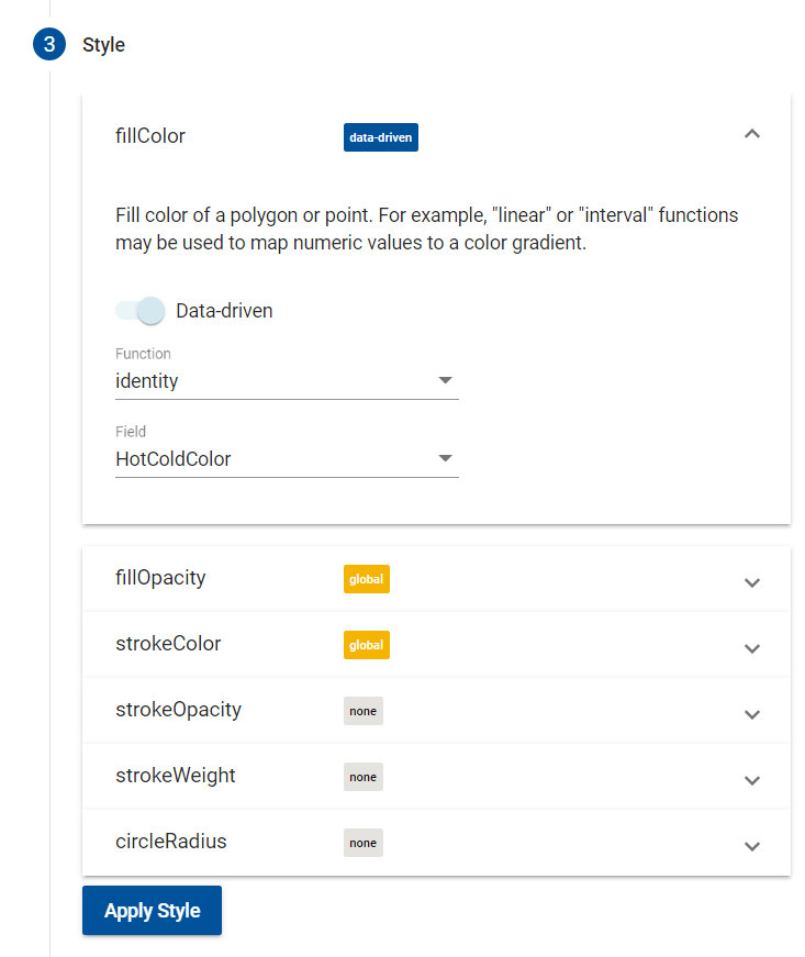
The FillColor section is the most critical, as it sets the color of each county area. I used the identify function and the value of the HotColdColor field to set the colors. You might find the other functions to be a better fit for your application, of course.
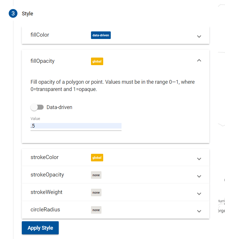
Then I set the transparency for the county colors to allow the background map features to show through the color with fillOpacity.
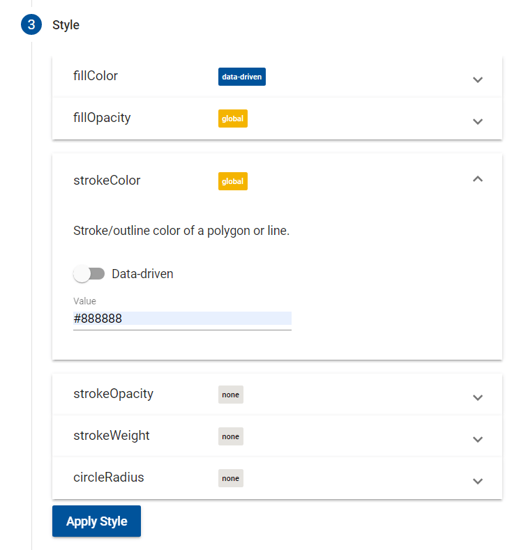
And outlined each county with a neutral grey using strokeColor.
Pressing the Apply button shows the map with the new styles and without requerying the data.
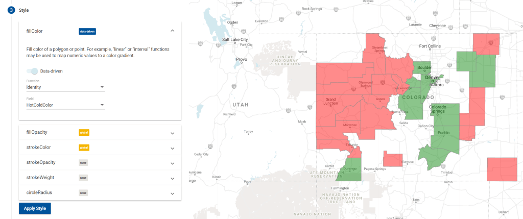
That’s the map I wanted! You can use familiar Google map controls to zoom around, but I’ve found that to be quite slow.
Getting it into a DataStudio report is unfortunately manual steps. Screen print, crop and save in a picture editor, upload to an image control in Data Studio. Sigh.
Show people, not counties
There’s one more trick you can do thanks to Lakshamanan. In the GeoViz Data step, there’s a choice betwen tract_geom and populated_tract_geom.
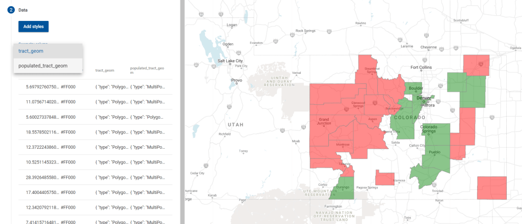
Tract_geom is county boundaries. Switch to the populated_tract_geom value and only places where people live will get colored. Lakshamanan’s data set outlines square kilometers where at least 10 people live.
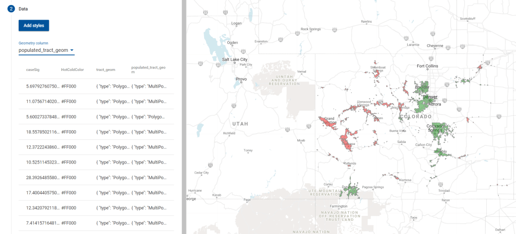
Pretty cool!
Summary
Using BigQuery, GeoViz, and a public data set it’s quite easy to create a county-by-county data visualization.
Thank you to Lak Lakshmanan for the excellent article!
Get new content delivered directly to your email. Unsubscribe anytime. I don’t share your email address with anyone.
